
🎨The Art of Creating Balance and Guiding the Eye

Composition is one of the fundamental principles of design and visual communication. It plays an essential role across many creative fields, including art, photography, graphic design, product displays, interior styling, and advertising imagery.
In simple terms, composition is the process of deciding where different visual elements should be placed and how they should relate to one another within a given space. In practice, however, composition is about much more than simply making an image look “beautiful.”
Good composition creates a clear Visual Hierarchy, allowing viewers to naturally understand what they should notice first, which elements are secondary, and how their eyes should move through an image or display.
The Getty Museum describes formal analysis in art as examining how visual elements and principles of design work together to create meaning and shape the viewer’s visual experience. From this perspective, composition is not simply about positioning objects. It is about the relationships between shape, space, visual weight, proportion, rhythm, and the viewer’s eye.
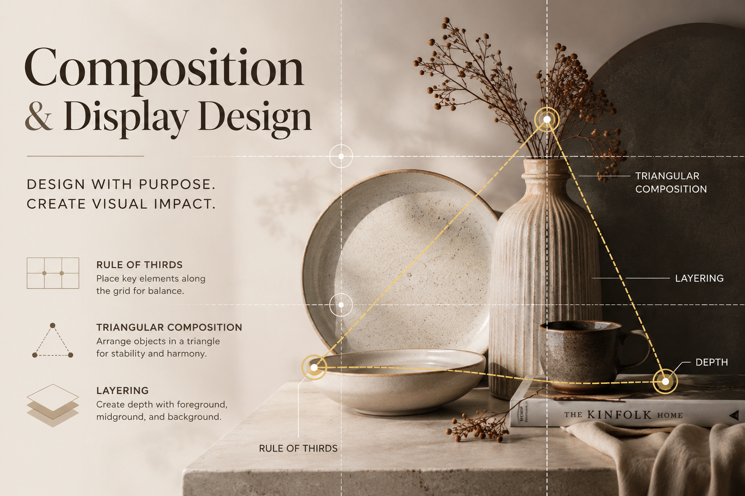
In Display Design, a strong understanding of composition can begin with three fundamental principles: the Rule of Thirds, Triangular Composition, and Layering.
📐1. Rule of Thirds: Creating Balance Without Centering Everything

The Rule of Thirds is one of the most widely used compositional guidelines in photography, film, graphic design, and visual display.
The basic idea is to divide a visual space into three equal sections horizontally and vertically, creating a nine-part grid with four key intersection points.
Rather than placing the main subject directly in the center, the focal point can be positioned along one of these dividing lines or near one of the intersections.
This often creates a composition that feels more natural, dynamic, and visually engaging than one in which everything is centered.
Why Does the Rule of Thirds Work?
When the main subject is positioned away from the center, the surrounding space begins to play an active role in the composition.
Negative space can balance the visual weight of the main subject, while secondary elements can help guide the viewer’s eye from one part of the composition to another.
For example, when creating a display for a tableware collection, a designer might position the main plate around one-third of the display area, then use a glass, textile, or smaller decorative object on the opposite side to create visual balance.
However, it is important to remember that the Rule of Thirds is not a strict rule.
It should be understood as a guideline or decision-making tool, rather than a formula that must always be followed.
Strong compositions can also be symmetrical, centered, or intentionally unbalanced.
The more important question is therefore not:
“Is the object positioned exactly on a Rule of Thirds intersection?”
Instead, we should ask:
“Does this position help the viewer understand what they should look at first?”
🔺2. Triangular Composition: Creating Structure and Relationships Between Objects

Another effective method for arranging multiple objects is Triangular Composition.
This technique involves positioning objects or visual points so that the viewer’s eye can connect them into an implied triangular structure.
The triangle does not need to physically exist in the image. Instead, it is created through imaginary lines formed by the relationship between different visual elements.
For example, imagine a display containing a tall vase, a plate, and a small cup.
The vase could become the highest point, while the plate and cup are positioned lower on either side.
When viewed together, these three objects create an implied triangular structure.
Why Is the Triangle So Effective?
A triangular structure can create both stability and hierarchy.
The highest point can become an important visual anchor, while the wider base gives the overall arrangement a sense of stability.
Triangular Composition does not have to be perfectly symmetrical.
In contemporary display design, an asymmetrical triangle can often feel more natural and visually dynamic.
For example, a display might include:
- One tall object
- One or two medium-height objects
- One low or flat object
The variation in height creates a natural visual movement from:
High → Medium → Low
This prevents the display from feeling flat or overly rigid.
Triangular Composition, therefore, does not simply mean “arranging objects into a triangle.”
Its purpose is to create a visual structure that allows multiple elements to work together as one coherent composition.
📚3. Layering: Turning a Flat Arrangement into a Dimensional Space

If the Rule of Thirds helps determine position, and Triangular Composition helps establish structure, then Layering helps create depth.
Layering involves organizing elements across different spatial levels:
Foreground — the area closest to the viewer
Midground — the middle area
Background — the area furthest from the viewer
Rather than arranging every object on the same visual plane, some elements can be placed closer to the viewer, while others are positioned further back.
Objects can also partially overlap.
This technique, known as overlap, provides an important visual cue that helps viewers understand which objects are closer and which are further away.
As a result, even a two-dimensional photograph can create a convincing sense of depth.
For example, in a styled product photograph:
Foreground: A textile, spoon, or small decorative detail
Midground: The main plate or product
Background: A vase, book, furniture, or environmental element
When these elements are separated by distance and allowed to overlap naturally, the composition begins to feel like a real environment rather than a collection of products placed against a background.
Layering Does Not Mean Adding More Objects
This is an important distinction.
Creating layers does not mean filling the composition with as many objects as possible.
Too many elements can compete for attention and weaken the focal point.
What matters more is the spatial relationship between elements.
Even three or four objects can create effective layering when there are differences in distance, scale, height, overlap, lighting, or sharpness.
Good layering is therefore about creating depth with intention — not filling empty space.
Bringing the Three Principles Together

Rule of Thirds, Triangular Composition, and Layering do not need to be used separately.
In fact, a single display can combine all three principles.
Imagine creating a display for a ceramic collection.
First, the hero product might be positioned around one-third of the visual space using the Rule of Thirds.
Next, objects of different heights can be arranged to create a Triangular Composition.
Finally, some objects can be moved forward and others further back to introduce Layering.
The result is a composition that can simultaneously create:
Balance — a sense of visual stability
Hierarchy — a clear order of importance
Movement — a natural path for the viewer’s eye
Depth — a sense of three-dimensional space
Focal Point — a clear area of attention
This is why composition should not simply be understood as “arranging objects beautifully.”
It is better understood as designing the journey of the viewer’s eye.
🖼️Composition as a Visual Journey

One useful way to understand composition is to imagine that the viewer is travelling through the image with their eyes.
When someone first sees a display, we can ask three simple questions:
First Look: What do they notice first?
Second Look: Where does their eye move next?
Third Look: What makes them stop, explore, or return to another part of the composition?
If every element has a similar size, color, height, and level of contrast, everything may compete for attention at the same time.
When everything tries to become the focal point, nothing truly becomes the focal point.
A strong composition instead establishes a relationship between:
Primary Elements — the most important visual elements
Secondary Elements — elements that support the main focus
Supporting Elements — details that complete the atmosphere or context
This hierarchy is especially important in Display Design.
The product should not have to compete with its props, and decorative elements should not become more visually dominant than the product they are intended to support.
🧩From Arrangement to Communication
A successful composition is not created simply by following the Rule of Thirds or constructing a perfect triangle.
Instead, all compositional decisions should answer one central question:
“What do we want the viewer to see and feel?”
If the goal is to make a product feel calm, minimal, and premium, the composition may use more negative space, fewer objects, and subtle layering.
If the goal is to create a more energetic and natural display, the designer may introduce asymmetry, variations in height, diagonal relationships, and stronger visual movement.
If several products need to be presented as one collection, Triangular Composition and Layering can help visually connect individual objects into a unified group.
Composition techniques should therefore not be used simply because a “rule” tells us to use them.
They should be selected according to the communication objective of the design.
A Simple Framework for Creating a Display

Before creating a display, designers can use five simple questions as a practical framework.
🎯1. Focal Point
What is the most important element?
Identify the one thing that should receive attention first.
📍2. Position
Where should the focal point be placed?
The Rule of Thirds can provide a useful starting point.
📏3. Structure
How can secondary elements support the focal point?
Look for relationships that can create a Triangular Composition.
👀4. Depth
Does the display have a foreground, midground, and background?
Create layers through distance, overlap, scale, and differences in height.
💡5. Edit
Is there anything that can be removed?
This final step is extremely important.
Good composition is not created only by what we choose to add.
It is also created by what we deliberately choose to leave out.
📈Conclusion
Good Composition Makes the Eye Feel Guided, Not Forced
Composition & Display Design is ultimately about creating structure within what the viewer sees.
Rule of Thirds helps establish position and balance.
Triangular Composition helps create structure and hierarchy.
Layering helps create depth and spatial relationships.
But none of these principles should be treated as an absolute formula.
A skilled designer does not simply follow compositional rules. Instead, they understand why those principles influence visual perception and know when to use, adapt, or intentionally break them.
Ultimately, the goal of composition is not for viewers to recognize which technique has been used.
The goal is for their eyes to move naturally, understand what matters, and experience the intended visual story without having to consciously think about it.
Because the strongest compositions are often the ones in which viewers never notice the structure at all.
They simply feel that everything is exactly where it belongs.
Leave a Reply