
Introduction
When discussing retail success, most people immediately think of product quality, competitive pricing, or promotional campaigns. While these factors are undoubtedly important, another critical element often goes unnoticed—the way customers move through a store.
Customer movement is far from random. Research in retail design, environmental psychology, and consumer behavior has consistently shown that shoppers follow predictable movement patterns. From the moment they enter a store, their brains begin processing spatial information, unconsciously deciding where to walk, what to look at, and where to stop.
These patterns are known as Traffic Flow, and when combined with Sight Lines—the strategic management of what customers see—they become one of the most powerful tools in Visual Merchandising.
Leading retailers such as IKEA, Apple, Nike, Sephora, MUJI, and Zara carefully design their store environments around these principles to increase customer engagement, improve product visibility, and ultimately drive higher sales.
What Is Traffic Flow?

Traffic Flow refers to the natural movement of customers throughout a retail environment—from the moment they enter the store until they complete their purchase.
It encompasses far more than simply walking from the entrance to the checkout. Traffic Flow includes:
- The routes customers choose
- Where they stop and browse
- Areas they naturally avoid
- The amount of time spent in different sections
- How they navigate between merchandise displays
An effective Traffic Flow encourages customers to explore more of the store, increasing product exposure and creating more opportunities for discovery and impulse purchases.
The longer customers remain engaged within the retail environment, the greater the likelihood of increasing both basket size and average transaction value.
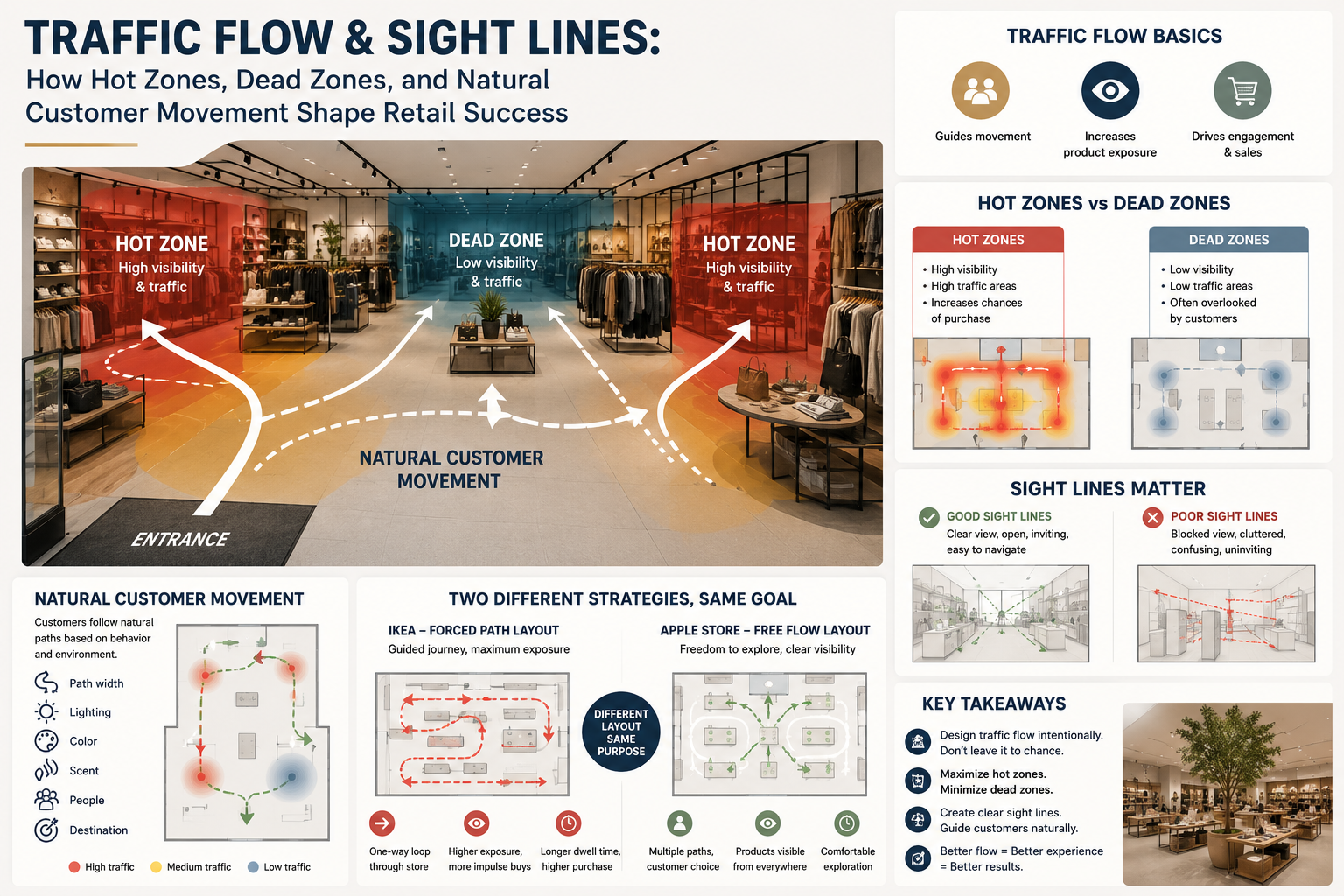
One of the most widely recognized concepts in retail psychology is the Invariant Right principle.
Research suggests that in many countries where people drive on the right side of the road and read from left to right, shoppers naturally tend to turn right shortly after entering a store.
Although this behavior is not universal across every culture, it has been consistently observed in numerous retail studies and has influenced store planning worldwide.
As a result, the front-right area of many retail stores experiences the highest concentration of customer traffic.
This area is commonly referred to as the Hot Zone.
Understanding Hot Zones
A Hot Zone is an area that naturally attracts the highest volume of customer attention and foot traffic.
Typical Hot Zones include:
- The front-right section near the entrance
- Primary circulation aisles
- Main pathway intersections
- End-cap displays
- Promotional islands
- Checkout queue areas
Because these locations receive the greatest customer exposure, they are ideal for showcasing:
- New product launches
- Best-selling merchandise
- Seasonal collections
- Limited-time promotions
- High-margin products
Products placed in Hot Zones have significantly greater opportunities to be seen, considered, and purchased.
More Isn’t Always Better
A common merchandising mistake is attempting to place every promotional product within a Hot Zone.
This often creates visual overload.
When customers are presented with too many competing messages, the brain struggles to prioritize information and may simply ignore everything.
Instead, each Hot Zone should focus on one clear message through:
- A strong Hero Product
- A single promotional theme
- Clear visual hierarchy
- An obvious focal point
Simplicity increases attention.
Understanding Dead Zones
Every retail environment also contains areas that receive very little customer traffic.
These are known as Dead Zones.
Examples include:
- Back corners of the store
- Narrow aisles
- Areas hidden behind fixtures
- Dead-end pathways
- Locations outside customers’ natural line of sight
Products displayed in these areas often underperform—not because of poor product quality, but because customers simply do not encounter them.
In retail, visibility often matters more than product quality alone.

Bringing Dead Zones to Life
Professional store planners employ several techniques to transform underutilized spaces into productive selling areas.
Destination Products
Place products customers intentionally seek—such as staple items or popular brands—in the back of the store.
This encourages shoppers to walk deeper into the retail space, increasing exposure to additional merchandise along the way.
Lighting
Lighting naturally attracts human attention.
Brighter areas tend to feel safer, more inviting, and more important, making strategic lighting an effective tool for drawing customers into quieter areas.
Color Contrast
Contrasting colors create visual magnets that naturally capture attention.
Accent colors, feature walls, and bold merchandising displays can help redirect customer movement toward less-visited sections.
Signage
Well-designed signage can significantly influence customer behavior.
Messages such as:
- New Arrival
- Limited Edition
- Staff Picks
- Special Offer
encourage customers to explore areas they might otherwise overlook.
Interactive Displays
Interactive experiences encourage customers to pause and engage.
Examples include:
- Product demonstrations
- Sampling stations
- Digital touchscreens
- Interactive merchandising displays
The longer customers remain in an area, the greater the opportunity for purchasing decisions.

What Are Sight Lines?
While Traffic Flow determines where customers move, Sight Lines determine what they see.
Sight Lines refer to the visual pathways customers experience as they move throughout the store.
Professional retail designers frequently evaluate a store from the customer’s perspective by asking:
“What is the very first thing customers notice from this position?”
The answer often determines whether they continue exploring or lose interest.

Characteristics of Effective Sight Lines
Well-designed Sight Lines allow customers to:
- See deeper into the store
- Easily identify key merchandise
- Recognize focal displays immediately
- Navigate the environment comfortably
The result is a retail space that feels open, welcoming, and easy to shop.
Poor Sight Lines
Conversely, poor Sight Lines occur when customers encounter:
- Tall fixtures blocking visibility
- Cluttered merchandise
- Confusing layouts
- No obvious focal point
These environments increase cognitive effort.
Instead of encouraging exploration, they create a sense of fatigue and uncertainty, often causing customers to leave sooner than intended.
Natural Customer Movement
Customers rarely explore every corner of a retail space.
Instead, they follow Natural Movement Patterns, which are influenced by factors such as:
- Store layout
- Aisle width
- Lighting
- Color
- Sound
- Scent
- Other shoppers
- Destination products
Successful retailers do not force customers to move.
Instead, they subtly guide behavior through thoughtful environmental design.
The experience feels intuitive rather than controlled.

The IKEA Effect in Store Layout Design
One of the world’s most recognizable examples of Traffic Flow design is IKEA.
IKEA primarily uses a Forced Path Layout, guiding customers along a carefully planned one-way route through nearly every department before reaching the checkout.
This strategy increases:
- Product exposure across the entire store
- Opportunities for impulse purchases
- Customer dwell time
- Cross-selling opportunities
By encouraging shoppers to experience the complete showroom, IKEA maximizes the likelihood of product discovery.
Apple’s Free Flow Approach
In contrast, Apple Stores utilize a Free Flow Layout.
Customers are free to move in any direction without following a prescribed route.
Although movement is unrestricted, the store is carefully designed so that key products remain visible from almost every location.
Wide open spaces, low fixtures, clear sight lines, and carefully positioned display tables allow customers to navigate naturally while maintaining continuous visual engagement.
The experience feels effortless, yet every design decision supports product visibility and customer interaction.
Two Different Strategies, One Common Objective
At first glance, IKEA and Apple appear to use completely different store layouts.
However, both rely on the same fundamental principle:
Traffic Flow is intentionally designed—not left to chance.
Whether using a structured journey like IKEA or an open exploration model like Apple, both retailers strategically guide customer movement to:
- Increase product visibility
- Encourage exploration
- Improve customer experience
- Extend dwell time
- Drive higher sales
The layout may differ, but the objective remains the same: to create an environment where customers naturally discover more products and engage more deeply with the brand.

Traffic Flow and Visual Merchandising
Traffic Flow alone cannot maximize retail performance.
Its effectiveness depends on integration with other Visual Merchandising elements, including:
- Color Blocking
- Focal Points
- Lighting Design
- Retail Storytelling
- Product Hierarchy
- Signage
- Store Layout Planning
Exceptional Visual Merchandising is not simply about making products look attractive—it is about designing an environment that naturally guides customers to see, explore, and purchase.
Conclusion
The world’s most successful retailers understand that customers do not simply buy products—they respond to environments that are thoughtfully designed.
By understanding Traffic Flow, Sight Lines, Hot Zones, Dead Zones, and Natural Customer Movement, retailers can optimize product placement, improve customer engagement, and increase sales without relying solely on discounts or promotions.
Ultimately, customers purchase not only what they planned to buy, but also what they discover throughout their journey.
Designing that journey is one of the most powerful responsibilities of Visual Merchandising, transforming retail space into an experience that drives both customer satisfaction and long-term business success.
Leave a Reply