
✨ Introduction
An attractive product display is not only about the products themselves. The colors, textures, and materials surrounding them also play an important role in creating atmosphere and communicating a brand’s identity.
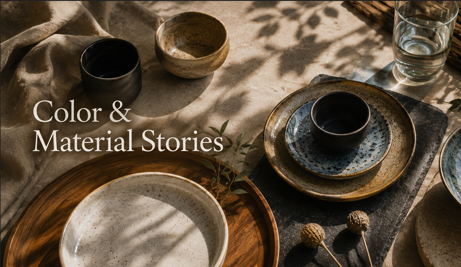
Color & Material Stories is an approach that brings these elements together in a thoughtful way, creating a cohesive display while helping the main products stand out. This is especially useful for ceramics, where different glazes, colors, and surface textures can create very different moods.
💡 What Are Color & Material Stories?
Color & Material Stories is the idea of creating a clear direction for a display through color, texture, and materials, rather than selecting each element separately.
The concept can be divided into three main areas:
- Color Families – Grouping related colors
- Texture Families – Grouping complementary textures
- Mixed-Material Displays – Combining different materials within a display
🎨 Color Families
A Color Family is a group of colors that work well together, helping products and displays feel balanced and visually connected.
Common color families include:
- Earth Tones — Brown, beige, cream, and terracotta

- Cool Tones — Blue, light blue, and green

- Warm Tones — Red, orange, and yellow

- Natural Tones — Colors inspired by soil, stone, sand, and nature
Choosing a clear color family makes it easier to create a consistent mood while allowing featured products to stand out.

🪨 Texture Families
A Texture Family brings together surfaces that share similar or complementary characteristics, adding depth and visual interest to a display.
Common ceramic textures include:
- Glossy — Smooth and reflective
- Matte — Soft and non-reflective
- Rough / Rustic — Textured and natural
- Speckled — Surfaces with visible spots or small details
- Reactive Glaze — Glazes with natural variations in color and surface finish

The surrounding materials should complement the texture of the ceramics. For example, matte ceramics + linen + natural wood can create a warm, handmade feeling, while glossy ceramics + glass + metal can create a more modern look.
🪵 Mixed-Material Displays
A Mixed-Material Display combines different materials to create contrast, depth, and visual interest.
Ceramics can be paired with a variety of materials:
- Ceramic + Wood — Creates a warm, natural, and handcrafted feel
- Ceramic + Linen — Creates a soft and relaxed look, ideal for tabletop and lifestyle styling
- Ceramic + Stone — Creates a natural, rustic, or premium atmosphere
- Ceramic + Metal — Adds a modern and contemporary character
- Ceramic + Glass — Creates a light and airy feeling while contrasting with the solid appearance of ceramics

The key is to choose one main material and use the others as supporting elements. Not every material needs to compete for attention.
⭐ Key Principles for Creating a Color & Material Story
Before creating a display, start by defining the Mood you want to communicate, such as Natural, Rustic, Modern, Coastal, or Luxury. Then choose the Color Palette, Textures, and Materials that support that direction.
- Color Harmony — Choose colors that work well together without competing for attention.
- Contrast — Use differences in color, texture, or material to create focal points.
- Texture Balance — Balance smooth and rough surfaces to add depth.
- Material Hierarchy — Define the main material and supporting materials.
- Product Focus — Every element should help the featured product stand out.
✨ Conclusion
Color & Material Stories is about using color, texture, and materials together to create atmosphere and tell a clear visual story. Color Families establish the overall palette, Texture Families add depth and character, and Mixed-Material Displays create interest through thoughtful combinations of materials.
The key is to make sure every element works together while keeping the product as the main focus of the display, rather than allowing the surrounding materials to compete for attention.
Leave a Reply